You don't have to be boring
Feb. 28th, 2010 01:37 pmI got this excellent story about a very funny computer manual via twitter, and I'm trying to use it as inspiration during revisions.
Here's the message I'm getting: You don't have to be boring.
Computer manuals, academic papers, and conference presentations aren't known for being good reading or watching, but that doesn't mean you have to be completely dull. I'm shocked at how few people seem to realize that you can be compelling and still be professional. Now, some of this may be just an eye-of-the-beholder thing, but I watched a grad student get up in front of a class to give a presentation, which consisted of his entire essay on overheads. He then stood with his butt directly in the face of the prof who was marking him, turned towards the screen and read out the essay. Slowly. In a dull monotone. And continued to do so even when the professor tried to engage him and finally, to at least get him to move. Clearly, there was room for improvement there, and I see this sort of worst-case presentation surprisingly frequently from my fellow grad students and intellectuals. It seems to be a prevalent problem that people see no reason to make their life's work more compelling, and I just don't understand why.
I'm currently revising my PhD thesis proposal, a supposedly boring document which explains to my thesis committee what I want to do so we can negotiate on what I need to finish in order to earn my PhD. So here are three writing lessons I'm reminded of by the Franklin manuals:
Play with the titles: even stealthy snark can improve your writing
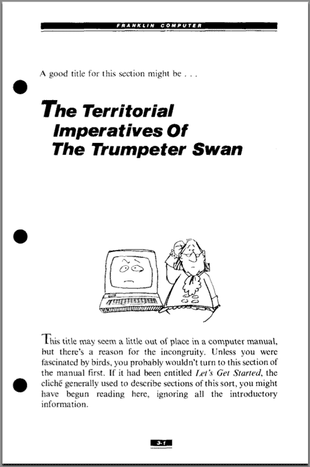
Go click that link and look at the first example where the intro section starts with, "The Ancestral Territorial Imperatives of the Trumpeter Swan" instead of a more traditional title like "Let's get started." Now, you're probably protesting already: Surely, this would not be acceptable in a professional environment! And sure enough, it's not. But it's perfectly acceptable to use a temporary title that makes you laugh while you're editing a document. Or if, like many academics, you write using LaTeX where comments are easy to fit in the document, you can leave yourself a few funny ones. Doing a presentation? You can probably leave the odd funny title out where other people can see it, as long as it's not in some way offensive. I do this all the time, and no one's complained, and sometimes it can garner a few snickers from the audience, which is always fun. :)
Why bother? You may have heard the advice to smile while you're doing a phone interview because it changes your tone. A little giggle before you write or a smile when you present that slide can do the same for you as that secret telephone interview smile. And the other great thing with temporary, silly titles is that they're often things that don't require a whole lot of thought, since you aren't planning on keeping them. I find them great for dealing with a spot of writer's block while outlining a section. Sometimes, once I've got a silly title, I find out that the section I wind up writing needs to be completely different from the one I thought I'd need there.
Examples are allowed to be fun
Apparently both the manuals described there make pop culture references as they try to explain difficult concepts. If you've never done this, you should try it. It can be as simple as using names and ideas from a favourite TV show in your examples, or sometimes you can leverage stuff people know to build more complex metaphors that a least some segment of your audience will intuit easily. For example: My supervisor sent me this great article explaining security principles using examples from star wars. It's fun, it gets the point across, and it's a lot more memorable than some lectures I've seen on similar topics. This is especially great as a presentation technique: take all your examples from one movie and then you can add in pictures to match! I saw this incredibly well done in a presentation at Yet Another Perl Conference::Canada some years ago.
Why do it? It's a fun way to inject some playful stuff without seeming less professional, and a well-chosen example can provide a lot of nuance and motivation. For example, I used to do something similar when I presented my computer immunology work. When you do computer immunology, you wind up having to explain the basics of protein-matching within the immune system a lot. This basically results in endless processions of blobs with lumpy detectors attached to them. I replaced my protein-blobs with cars, and made detectors that protected you from an infection of compact cars. Much more fun, plus people could play gues-the-make-and-model if they were already familiar with the immunology, which mean they didn't tune out at the beginning. And it secretly reminds people that just like there are millions of cars with the same make/model and thus the same shape, plus or minus a few dings, we similarly have lots of proteins of each type, and they each have the same shape, plus or minus a few dings.
OMG, Pictures
Go scroll down and look at the cartoons. Cute, eh? Or scroll back up and look at the difference between the typesetting in that first example vs the second one with the picture and the nice typesetting:


Although the content in the second one apparently isn't as nicely done, it's certainly a lot easier on the eyes, isn't it? So why do so many academics do presentations without a single picture on the slides? Use graphs! Use cartoons! Use a little bit of clip art! Need some inspiration? Take a look at the fun flickr photos that illustrate Cate's blog: Accidentally in Code (Here's a recent favourite post). I try to do this with my own web security blog (here's one I put with an article on how spam isn't making money. It still makes me laugh.) Flickr's a great source for creative-commons content that you're free to use if you don't have the right picture yourself. And yes, those pictures can be the sneaky snark from tip number 1: I used to accompany the slide explaining gene libraries with a picture of... a Levi's jean store. I don't know if anyone noticed other than my sister (who found the photo for me), but I knew!
I'm sure you can find plenty of reasons that pictures help your audience learn. But there are also two sneaky reasons this is a good idea: if you make space for pictures, you often have to cut down on the number of words on your slides. Generally speaking, less is more when it comes to slides, and shrinking them down may serve as a good reminder that you probably should be presenting just a basic idea, not your entire paper/life's work/declaration of independence. You want a few gems, not a novel. And that brings me to the second reason this is a good idea: in doing so, you've put a lot more work into your slides, and it shows. Having pretty slides with pictures on them says you thought about what was an appropriate picture, took time to find it, edit the slide so it fit nicely... basically, it's another way to dress up nicely before a presentation, only its your slides rather than you with the nice clean shirt.
This doesn't always work for academic papers, but it's worth sitting down and thinking: are there ways I could illustrate this data? These examples? Sometimes a well-placed diagram can make a world of difference. Not sure how to start? Ask someone. Try explaining your work to a friend and see if you wind up scribbling something down on a napkin to make it make more sense, or what hand gestures you're using. Try to imagine presenting your work with slides that have only pictures (seriously! I've done it and it's a great exercise.)
---
So, there's three things I'm going to try to keep in mind while I finish up this draft. It's gotten me thinking of a few more tips I'd like to keep in mind (such as how to be more concise... oops), but I've got to get back to making my thesis proposal more awesome. Wish me luck!
Here's the message I'm getting: You don't have to be boring.
Computer manuals, academic papers, and conference presentations aren't known for being good reading or watching, but that doesn't mean you have to be completely dull. I'm shocked at how few people seem to realize that you can be compelling and still be professional. Now, some of this may be just an eye-of-the-beholder thing, but I watched a grad student get up in front of a class to give a presentation, which consisted of his entire essay on overheads. He then stood with his butt directly in the face of the prof who was marking him, turned towards the screen and read out the essay. Slowly. In a dull monotone. And continued to do so even when the professor tried to engage him and finally, to at least get him to move. Clearly, there was room for improvement there, and I see this sort of worst-case presentation surprisingly frequently from my fellow grad students and intellectuals. It seems to be a prevalent problem that people see no reason to make their life's work more compelling, and I just don't understand why.

I'm currently revising my PhD thesis proposal, a supposedly boring document which explains to my thesis committee what I want to do so we can negotiate on what I need to finish in order to earn my PhD. So here are three writing lessons I'm reminded of by the Franklin manuals:
Play with the titles: even stealthy snark can improve your writing
Go click that link and look at the first example where the intro section starts with, "The Ancestral Territorial Imperatives of the Trumpeter Swan" instead of a more traditional title like "Let's get started." Now, you're probably protesting already: Surely, this would not be acceptable in a professional environment! And sure enough, it's not. But it's perfectly acceptable to use a temporary title that makes you laugh while you're editing a document. Or if, like many academics, you write using LaTeX where comments are easy to fit in the document, you can leave yourself a few funny ones. Doing a presentation? You can probably leave the odd funny title out where other people can see it, as long as it's not in some way offensive. I do this all the time, and no one's complained, and sometimes it can garner a few snickers from the audience, which is always fun. :)

Why bother? You may have heard the advice to smile while you're doing a phone interview because it changes your tone. A little giggle before you write or a smile when you present that slide can do the same for you as that secret telephone interview smile. And the other great thing with temporary, silly titles is that they're often things that don't require a whole lot of thought, since you aren't planning on keeping them. I find them great for dealing with a spot of writer's block while outlining a section. Sometimes, once I've got a silly title, I find out that the section I wind up writing needs to be completely different from the one I thought I'd need there.
Examples are allowed to be fun
Apparently both the manuals described there make pop culture references as they try to explain difficult concepts. If you've never done this, you should try it. It can be as simple as using names and ideas from a favourite TV show in your examples, or sometimes you can leverage stuff people know to build more complex metaphors that a least some segment of your audience will intuit easily. For example: My supervisor sent me this great article explaining security principles using examples from star wars. It's fun, it gets the point across, and it's a lot more memorable than some lectures I've seen on similar topics. This is especially great as a presentation technique: take all your examples from one movie and then you can add in pictures to match! I saw this incredibly well done in a presentation at Yet Another Perl Conference::Canada some years ago.

Why do it? It's a fun way to inject some playful stuff without seeming less professional, and a well-chosen example can provide a lot of nuance and motivation. For example, I used to do something similar when I presented my computer immunology work. When you do computer immunology, you wind up having to explain the basics of protein-matching within the immune system a lot. This basically results in endless processions of blobs with lumpy detectors attached to them. I replaced my protein-blobs with cars, and made detectors that protected you from an infection of compact cars. Much more fun, plus people could play gues-the-make-and-model if they were already familiar with the immunology, which mean they didn't tune out at the beginning. And it secretly reminds people that just like there are millions of cars with the same make/model and thus the same shape, plus or minus a few dings, we similarly have lots of proteins of each type, and they each have the same shape, plus or minus a few dings.
OMG, Pictures
Go scroll down and look at the cartoons. Cute, eh? Or scroll back up and look at the difference between the typesetting in that first example vs the second one with the picture and the nice typesetting:

Although the content in the second one apparently isn't as nicely done, it's certainly a lot easier on the eyes, isn't it? So why do so many academics do presentations without a single picture on the slides? Use graphs! Use cartoons! Use a little bit of clip art! Need some inspiration? Take a look at the fun flickr photos that illustrate Cate's blog: Accidentally in Code (Here's a recent favourite post). I try to do this with my own web security blog (here's one I put with an article on how spam isn't making money. It still makes me laugh.) Flickr's a great source for creative-commons content that you're free to use if you don't have the right picture yourself. And yes, those pictures can be the sneaky snark from tip number 1: I used to accompany the slide explaining gene libraries with a picture of... a Levi's jean store. I don't know if anyone noticed other than my sister (who found the photo for me), but I knew!
I'm sure you can find plenty of reasons that pictures help your audience learn. But there are also two sneaky reasons this is a good idea: if you make space for pictures, you often have to cut down on the number of words on your slides. Generally speaking, less is more when it comes to slides, and shrinking them down may serve as a good reminder that you probably should be presenting just a basic idea, not your entire paper/life's work/declaration of independence. You want a few gems, not a novel. And that brings me to the second reason this is a good idea: in doing so, you've put a lot more work into your slides, and it shows. Having pretty slides with pictures on them says you thought about what was an appropriate picture, took time to find it, edit the slide so it fit nicely... basically, it's another way to dress up nicely before a presentation, only its your slides rather than you with the nice clean shirt.
This doesn't always work for academic papers, but it's worth sitting down and thinking: are there ways I could illustrate this data? These examples? Sometimes a well-placed diagram can make a world of difference. Not sure how to start? Ask someone. Try explaining your work to a friend and see if you wind up scribbling something down on a napkin to make it make more sense, or what hand gestures you're using. Try to imagine presenting your work with slides that have only pictures (seriously! I've done it and it's a great exercise.)
---
So, there's three things I'm going to try to keep in mind while I finish up this draft. It's gotten me thinking of a few more tips I'd like to keep in mind (such as how to be more concise... oops), but I've got to get back to making my thesis proposal more awesome. Wish me luck!